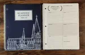
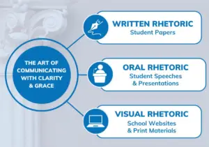
I (Patrick) divide my time between two roles. As an educator, I guide students through senior thesis projects, helping them choose great topics to research, write about, and defend during public presentations. As a graphic designer, I help school leaders create engaging websites, annual fund brochures, student planners, and more. These seemingly unrelated enterprises actually have quite a bit in common: they are about rhetoric—written, oral, and visual.
If you’re involved in classical education you already know about written and oral rhetoric, but you may not have thought about graphic and website design as a form of rhetoric in quite the same way.
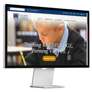
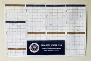
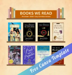
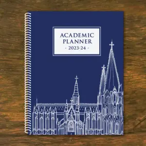
However, if “a picture is worth a thousand words,” that means visual rhetoric may be the most powerful of the three. And just as a speaker communicates a great deal through nonverbal communication (eye contact, gestures, appearance, etc.) effective graphic design—whether on a poster, slideshow, or website—also includes important nonverbal elements that shape the message being communicated.
Consider the impact of elements like:
- Typography
- Color Schemes
- Layout & Composition
- Imagery & Photos
- Symbolism & Iconography
- User Interface
Some might assume that graphic design is just pragmatic packaging for the important stuff—the message itself. But that’s not how visual communication works, just like that’s not how language works. Is a poem merely packaging for an underlying message? (Try telling that to a literature teacher and see what kind of response you get.)
At the end of the day, my goal for my seniors and for the schools I work with are essentially the same. I want to help them express a clear, graceful message that resonates strongly with their audience. Whether that message is a persuasive essay on politics, a speech about the arts, or a website for peaking the interest of prospective parents, it all comes back to good rhetoric.